
You’re weeks away from going live. Here’s the brand infrastructure you need sorted before you do.
Most startups launch with a logo, a colour palette they picked in an afternoon, and a vague sense that “we’ll figure out the brand stuff later.”
Then later arrives — fast.
A developer needs the logo for the app store listing. A marketer needs the HEX codes for an ad banner. A freelance copywriter asks what the tone of voice is. An investor wants a one-pager and it looks nothing like the website.
Suddenly, “the brand” isn’t a design problem. It’s a coordination problem. A speed problem. An embarrassing inconsistency-in-front-of-people-who-matter problem.
The fix isn’t complicated, but it has to happen before launch — not after. This guide covers exactly what belongs in your startup’s brand kit, why each piece matters, and how to get it organised so your team can actually use it.
Why Pre-Launch Is the Only Time to Do This Right
Once you launch, brand decisions happen reactively. Someone needs something, they grab whatever’s closest, and a pattern of inconsistency quietly takes hold. The landing page uses one shade of blue. The pitch deck uses another. The LinkedIn banner has an old logo version. The email signature has no logo at all.
None of these things kill a startup on their own. But together, they signal something investors, partners, and potential customers notice even if they can’t articulate why: this team isn’t quite put together.
Building your brand kit before launch means:
- Every person touching your brand — employees, contractors, agencies — has one place to get the right assets
- You make brand decisions once, not every time someone needs a file
- You look like a real company from day one, even if you’re a team of three
It also forces you to make decisions you’d otherwise defer. What is our visual hierarchy? What does our brand actually sound like? What’s the logo on a dark background? Better to answer these questions in week three than when you’re scrambling to send materials to a journalist.
The Core Brand Kit: What You Actually Need
A brand kit for a pre-launch startup doesn’t need to be a 60-page PDF. It needs to be complete, usable, and accessible to everyone who needs it. Here’s what that means in practice.
1. Logo System
Your logo is not one file. It’s a system. And if you only have one version, you’ll run into problems the first time you need it somewhere unexpected.
What to have ready at launch:
Primary logo — The full version of your logo in your brand colours. This is the default for most use cases: website header, pitch decks, official documents.
Icon / symbol mark — The standalone icon, without the wordmark. You’ll need this for your favicon, app icon, browser tab, and any small-format context where the full logo is too wide to work.
Horizontal and stacked versions — If your logo has both a name and a symbol, you’ll need a version where they sit side by side (horizontal) and one where they stack. Different layouts call for different proportions.
Monochrome versions — One all-black and one all-white version of every logo variation. Merchandise, presentations, legal documents, embroidered items — monochrome versions get used constantly.
Reversed / white version — For dark background use. This becomes critical when you start running digital ads, building dark-mode interfaces, or using branded backgrounds in social content.
File formats to have on hand:
- SVG (scalable, web-use)
- PNG with transparent background (at multiple sizes: 512px, 1024px, 2048px)
- PDF (print-ready vector)
If you only have a JPEG of your logo, that’s the first thing to fix. A JPEG is not a brand asset — it’s a photograph of one.
2. Colour Palette
Your colour palette is the most referenced element in your brand kit. Developers, designers, marketers, and tools all need colour values — and if they’re not documented clearly, everyone will use slightly different versions.
Primary palette Two to four colours that define your brand’s visual identity. These appear on your logo, website primary elements, and core marketing materials.
Secondary / supporting palette Three to six complementary colours for backgrounds, typography, UI states, charts, and accent use. These expand your visual range without breaking consistency.
Document every value for every colour:
| Format | Used for |
|---|---|
| HEX | Web and digital (e.g. #1A73E8) |
| RGB | Screen design (e.g. 26, 115, 232) |
| CMYK | Print materials (e.g. 89, 50, 0, 9) |
| HSL | CSS and design tools |
Startups commonly skip CMYK because “we’re digital-first.” Then they get their first batch of business cards printed and the blue comes back purple. Document all four from the start.
Colour usage rules Which colour dominates? What percentage of a layout should the primary colour occupy? What combinations are approved, and which are off-limits? A simple ratio (e.g. “60% primary, 30% secondary, 10% accent”) makes this easy for anyone to follow.
Accessibility pairs Identify which text/background colour combinations meet WCAG AA contrast standards. At minimum, document your default body text colour on your default background colour. This matters for SEO, legal compliance, and just not alienating a chunk of your audience.
3. Typography
Fonts are where brand consistency breaks down most quietly. When the guidelines say “we use Neue Haas Grotesk” but no one has the font, the presentation gets built in Arial and the problem compounds from there.
What to document:
Primary / display typeface — Used for headlines, hero statements, and prominent text. This is the font that gives your brand its visual personality.
Body / secondary typeface — Used for paragraphs, UI copy, and any context where extended reading happens. Usually more neutral and optimised for legibility.
Fallback stack — For web and app use, specify the fallback font stack in case the primary font fails to load.
For each typeface, document:
- Font name and foundry
- Weights in use (e.g. Regular 400, Medium 500, Bold 700)
- Where to get it (licence link or embed code)
- Approved sizes for H1–H4, body, captions, and CTA text
Don’t forget: If you’re using Google Fonts, include the embed code. If you’re using a paid typeface, be explicit about whether the licence covers distribution to contractors. This detail catches people off guard.
4. Brand Voice and Messaging
This is the part most startups skip entirely, and it’s the part that causes the most damage at scale.
Visual consistency is visible. A misaligned logo jumps out. But voice inconsistency is invisible — it accumulates in hundreds of small choices. The tone in your onboarding emails, the way your 404 page reads, how the team writes on LinkedIn. If there’s no documented voice, everyone defaults to their own style and the brand sounds like it has multiple personalities.
What to document before launch:
One-line brand purpose — What does your startup fundamentally do, and for whom? Not the VC pitch version — the clearest, plainest version.
Personality descriptors — Three to five adjectives that define how the brand communicates. “Clear, direct, a little irreverent” is more useful than “innovative and customer-centric.” Include the opposite descriptors too: what the brand is not.
Tone of voice guidelines — How does the formality level shift across contexts? (Technical docs vs. social posts vs. error messages.) Include before/after examples — these are worth ten pages of theory.
Tagline and core messages — The approved tagline and the two or three key messages that should be consistent wherever the brand appears. These aren’t just for marketing — they’re reference points for anyone writing anything under the brand name.
5. Brand Usage Rules
Everything above tells people what the brand is. This section tells them how not to break it.
Logo do/don’ts
- Minimum size (don’t scale it smaller than X pixels / millimetres)
- Clear space (minimum empty space around the logo)
- What you cannot do: stretch it, recolour it, put it on a clashing background, add drop shadows, outline it, rotate it
Colour don’ts
- Which colour combinations are off-limits
- When not to use the primary colour at full saturation
- What the brand looks like in greyscale (useful to include)
Typography don’ts
- No font substitutions
- No all-caps body text
- No mixing more than two typefaces in a single layout
A short “never do this” section with visual examples is often the most-referenced part of any brand kit. Make it impossible to get wrong.
6. Core Branded Templates
Your brand kit needs to be usable, not just a reference document. For a pre-launch startup, that means having at least the essential templates ready on day one.
Email signature — A consistent HTML email signature for every team member. This is the most-seen piece of branded collateral you’ll ever create, and most startups launch with five different versions.
Pitch deck template — A presentation template in Google Slides or PowerPoint with branded fonts, colours, and layout grids. You’ll use this constantly for investors, partners, and customer demos.
Social media profile assets — Profile image crops and banner assets for LinkedIn, X/Twitter, and any other platforms you’ll use at launch. Platform specs change — document the dimensions you’ve used.
One social post template — Even one Canva or Figma template for branded social content saves enormous time and prevents everyone from improvising their own version.
Document / letterhead template — A branded Google Doc or Word template for proposals, contracts, and any formal correspondence.
7. Delivery: The Part That Determines Whether Any of This Gets Used
Here’s the honest truth about brand kits that no one says loudly enough: most of them are never opened after delivery.
A PDF buried in a shared drive gets found once, maybe twice, and then ignored. An assets folder no one can navigate gets downloaded once and never updated. A ZIP file emailed to the founding team has a six-month shelf life before it’s lost.
The answer isn’t more documentation. It’s better access.
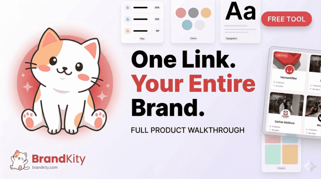
BrandKity is a free brand kit tool built exactly for this — you upload your logos, colours, fonts, files, and guidelines once, and it generates a single shareable link where everything lives. Anyone on your team — or any contractor or agency you work with — can access the full brand kit instantly, from any device, without asking someone to “send over the files again.”
For a pre-launch startup, the practical impact is immediate:
- One link for everything. Share it in your Slack, your Notion, your contractor onboarding doc. Brand consistency starts with accessibility.
- Always current. When your logo gets refined or a colour gets tweaked, you update it in BrandKity once. The link stays the same. No version control chaos.
- Scales as you grow. When you hire your fifth employee or bring on a new design agency, onboarding them to the brand takes thirty seconds — not thirty emails.
- Free to start. For a bootstrapped team watching every dollar, this is one of the few brand tools that costs nothing to set up and immediately makes everyone’s life easier.
The goal is to make the right assets the easiest assets to use. BrandKity does exactly that.
The Pre-Launch Brand Kit Checklist
Copy this into your project management tool and run through it before you go live:
Logo System
- [ ] Primary logo (full colour, all approved formats)
- [ ] Icon / symbol mark
- [ ] Horizontal and stacked variations
- [ ] Monochrome versions (black and white)
- [ ] Reversed / white-on-dark version
- [ ] Clear space and minimum size rules documented
Colour Palette
- [ ] Primary palette with HEX, RGB, CMYK values
- [ ] Secondary / supporting palette
- [ ] Approved text/background pairs (accessibility checked)
- [ ] Colour usage ratios documented
Typography
- [ ] Primary typeface with weights and sizes
- [ ] Secondary / body typeface
- [ ] Font files or licence/embed instructions
- [ ] Type scale (H1–H4, body, captions, CTA)
Brand Voice
- [ ] Brand purpose (one sentence)
- [ ] Personality descriptors (and anti-descriptors)
- [ ] Tone of voice with before/after examples
- [ ] Approved tagline and core messages
Usage Rules
- [ ] Logo do/don’ts with visual examples
- [ ] Colour restrictions
- [ ] Typography restrictions
Templates
- [ ] Email signature (HTML)
- [ ] Pitch deck template
- [ ] Social profile and banner assets
- [ ] Social post template (Canva/Figma)
- [ ] Document / letterhead template
Delivery
- [ ] All assets named consistently and organised
- [ ] Brand kit link created and live (BrandKity)
- [ ] Link shared in team onboarding docs, Notion/Confluence, Slack
You Don’t Need Perfect — You Need Complete
The startup instinct is to ship fast and fix later. That’s the right instinct for your product. It’s the wrong instinct for your brand infrastructure.
Your brand kit doesn’t need to be beautiful. It doesn’t need to be a 40-page brand bible. It needs to be complete, accurate, accessible, and used. Those are four very different requirements, and the checklist above addresses all of them.
Get it done before launch. Set it up in BrandKity so your team can actually find it. Then stop worrying about the brand questions and focus on the hundred other things you need to ship.
Building your startup’s brand from scratch? BrandKity is free to use — you can set up your full brand kit at brandkity.com in under an hour.